The 2019 #PlanToGrow Tracker

#PlanToGrow Tracker (1)

A Need for Structure –> #PlanToGrow

In October of 2017, I wrote up some Data and Analytics related goals that I wanted to obtain by the end of the 2018 calendar year. My list contained six goals, all of which I felt were obtainable, but would take some dedication and hard work, in order to achieve. At the end of 2018, I sat down to review this list and realized for the first time, that while the fifth item on my list was checked complete, it hadn’t really been FULLY completed. The item read as follows; ‘Improve and Learn Every Week.’ While, I felt 2018 had seen me take some big steps forward in my journey, I didn’t feel I had improved and learned EVERY week throughout the year. So, in 2019 I wanted to do better. Realizing there is a ton of room for me to grow in this space and endless resources available, I decided that tracking my growth would not only accelerate my learning while holding me accountable, but it would also allow me to eventually share the idea with others!! And so, #PlanToGrow was born. I started by compiling lists of blogs, vlogs, videos, podcasts, books, community projects, anything and everything I wanted to learn around the topic of Data and Analytics, in 2019. So, with good enough lists to get me through at least the first few months of the year, I felt ready to get started. Each week throughout 2019, I would Tweet out what I planned to learn for that week. Then, after checking an item off the list, I would track it in a Google Sheets document. This was because I eventually wanted to visualize the results in Tableau. But, thanks to Sarah Bartlett and #IronQuest, I was able to make the visual part of the project a reality much sooner than it otherwise would have happened. #IronQuest’s February theme was “business dashboards,” so I thought what better time than now to put my data into a visual form, start tracking my progress in Tableau and share the templates with the community?

Learning and Tracking

To be honest, I put no thought whatsoever into where I would track my data, but instead went right to Google Sheets, where I felt comfortable and knew it could easily be shared once that time came. So, my tracker began and has evolved slightly over the past month or so. It may not be elegant, but it works; Here’s how. As mentioned earlier, at the beginning of each week, typically on Sunday night or Monday morning, I’ll Tweet out my plan for the week. That Tweet will look something like…

tweet

…then, throughout the week, as items are completed, they are tracked in the Google Sheets document. I shared the project at the February Twin Cities Tableau User Group meeting and was asked how I stay disciplined in my tracking. The answer is that Google Sheets is almost always open on my computer, so on good days, as soon as I finish reading a blog post or watching a video, I’ll turn right to Google Sheets and enter in the data. Otherwise, the app is on my phone, so that has helped tremendously, as well. With blogs/vlogs being the easiest resources to consume, after a couple weeks, I found that rather than bounce around, it was a good idea to focus on learning from just one individual each week. Therefore, in a worst case scenario, if I dropped the ball on tracking for that week, a quick pull-up of that person’s blog would allow me to scroll through the content and know whether or not I had read/watched each item. And with so many amazing people in our community having more than enough content on their blogs for me to get through in a week, this just seemed to make sense.

Sharing With Others

For me, the most exciting part of this project is the opportunity to share the idea and materials, with others. Having been engaged in the Tableau community for just over 18 months now, I know firsthand just how overwhelming it can be. There is SO MUCH amazing information out there, but sometimes it can be difficult to even know where to begin. In 2018, there were many occasions in which my free/learning time was unproductive, because too much of it was wasted with trying to figure out which blog post to read, which video to watch or what viz to download and reverse-engineer. Thanks to #PlanToGrow, my learning experience in 2019 has been much more relaxing and enjoyable. It really is amazing what a difference being prepared can make.

From beginning to end, the #PlanToGrow project has helped me in several ways. First and foremost, planning ahead helps me stay focused and on track each week…no more time wasted! Staying disciplined in tracking has helped that part of the project to not fall completely off the rails. Without the consistent tracking, there is no final piece of the project, the visual component in Tableau. The visuals allow me to quickly and easily see how I’m tracking to my overall goals and what each week looks like. Additionally, I can see how my community participation has been and which days of the week I need to be more productive. Shocker…I’m least productive on the weekends! All that is great, but my favorite part of the Tableau viz is the combination of the Set Actions and URL Actions that allow for lightning quick access to every piece of material I’ve covered in 2019. So many times in the past, I would read a great blog post or watch a useful video and then several weeks later, come across a situation where that very blog post or video would come in handy. But, in some cases I would be left asking myself…”what was that video called?” or “who wrote that blog post, again?” or “I swear I saw that on Twitter, right?” only to either fail in finding it again or waste too much time in the process of finding it. There will be no more of that…every great learning resource will now be a section of the treemap. Easily accessible from either directly within the treemap or by first selecting a category from the bar chart, to narrow down the options within the treemap. I love this!!

If you would like to create your own #PlanToGrow Tracker, all you need to do is follow a few simple steps. First, you will need to download a copy of the 2019 #PlanToGrow Tracker Template from my Google Drive and that can be found here. This document includes a Data tab as well as a Directions tab that explains the process of making this your own. Secondly, you will need to download the Tableau workbook and replace my data with yours. The workbook can be found here. That’s it!! If you’d like, feel free to share your workbook on Twitter and tag me (@JtothaVizzo) so I can see it.

Have fun and enjoy!

2018 – A Year in Review

With the New Year quickly approaching and before I head out onto the ice covered roads of Minnesota tomorrow morning, to head to my family Christmas in the middle of nowhere, I wanted to take some time to reflect on 2018, a year I will always look back on as being pivotal in my career. Let’s rewind to set the stage.

2018goals

A NICE END TO 2017

As 2017 was winding down, I found myself smack dab in the middle of a job hunt, seeking to move on from a role and a company where I struggled to see any sort of future for myself. So, I had put myself out there, having no idea of what the future might hold. But in my job search, two things were clear; 1) It was important for me to find a position where I would be working with Tableau every day (we’ll get to why this was important in a later post) and 2) having not used Tableau in my job for nearly two years, I would need to convince somebody that I was worthy of such a position (yes, you read that correctly, I had previously left a job in which I used Tableau daily for a job in which I did not have access to Tableau…was I crazy? We’ll cover this in that later blog post). With 2018 right around the corner, things were starting to look up, regarding the job search. In early December of 2017, much to my surprise and delight, I was recognized by Tableau Public as a Tableau Public Featured Author! Not only was this an absolute thrill for me, but it also served as reassurance that all of those evening hours spent working on my Tableau Public Portfolio were starting to pay off. A few short weeks later, I agreed to join Daugherty Business Solutions, as a Data and Analytics Consultant, working out of their Minneapolis office! With 2017 ending on a high note, I was pumped to bring on 2018! In October of 2017, I had written up some VizGoals for 2018 (shown below with a little something extra from my daughter). When I wrote them down, I was probably a month or two into my job search and these goals would serve as additional motivation for me to find a Tableau related position, as a few were directly dependent on obtaining such a role. Although a couple were fairly generic, I’m happy to report that all of these goals, for 2018, were checked. While achieving 1, 3 and 5 will truly be a continuous effort, numbers 2, 4 and 6 are discrete 🙂 Time to reflect on an unforgettable 2018.

IT’S A BOY!!

On January 20th, 2018, my wife and I welcomed our second child into the world. A beautiful, healthy, baby boy. Today, Kellen is just over 11 months old and together, he and his big sister keep mommy and daddy very busy and constantly on our toes. Although our house is absolutely crazy at times, we feel very thankful to have been blessed with two wonderful little kiddos. Oh, and just for the record, on Kellen’s first full day on earth, the Minnesota Vikings were demolished in the NFC Championship game by the Philadelphia Eagles, 38-7. Welcome to life as a Minnesota sports fan, bud!! Just kidding, he can be a fan of whoever he wants to…except for the Green Bay Packers…and the New York Yankees…and Duke basketball…and USC football…and Alabama football…and…

JOINING DAUGHERTY AND BECOMING CERTIFIED

Nine days after Kellen was born, I started my new job at Daugherty Business Solutions. Working for Daugherty has been a breath of fresh air. While I get to work alongside and learn from some incredible people every day, Daugherty has also been extremely supportive in my professional development. Just a few weeks after joining the Daugherty team, I reached a goal that had been on the docket for awhile; becoming a Tableau Desktop Qualified Associate. Having been in my role for nearly a year now, I feel that 2018 would have looked entirely different for me, had I not been given the opportunity to join Daugherty, so I’d like to say thank you to Tim Herby and team for seeing the potential in me and taking a chance.

VIZ OF THE DAY

Somewhere early on in 2018, I made a mental note that a new goal of mine was that I wanted to create a visualization that would be good enough to be considered for a #VOTD. Having seen so many amazing Viz of the Day’s, it was like I just had to find out what it felt like to be selected, but the question was how? After reading a few blog posts, I formulated a plan for what would be my first dedicated attempt at capturing a #VOTD. And luckily enough, when I posted my ‘The 50 Greatest Scorers in NBA History’ viz (which was inspired by Michael Mixon’s The Level is in the Details) back on May 30th, on the eve of the NBA Season Opener, it was selected the next day, as #VOTD. And since I already had all the data for each of the top 50 scorers, I began working on a Michael Jordan viz soon after, capturing the scoring of every game throughout his NBA career. Less than a month later, that viz would also become #VOTD. I was super excited, but as one co-worker put it “Well, it’s basically the same viz, so the Jordan one doesn’t really count.” I know he was just giving me a hard time, but that was all the motivation I needed. I was now on a mission for a third #VOTD. Sticking with the sports theme, I aimed at a viz that would be published prior to the NFL season opener. My recent infatuation with jump plots led me down the road of trying something out with them. I don’t recall exactly how the idea came about, but I thought using jump plots could be a cool way to show the wins and losses of NFL teams, with wins jumping above the axis and losses falling below. So, with some inspiration from Chris DeMartini and Sam Parsons, I put together the ‘NFL Win-Loss Margins’ viz that included every game for every team, in the Super Bowl era. I had a lot of fun working on the viz and was really proud of how it turned out. On September 6th, the day of the NFL season opener, it was selected as #VOTD.

SPEAKING OPPORTUNITIES

I remember sitting in a November 2017 TCTUG (Twin Cities Tableau User Group) meeting and being blown away by a presentation given by Luke Stanke and thinking “Wow, how cool would it be to be THAT good at Tableau?!!” Well, I’m here to report I am not THAT good at Tableau, as I still have a long way to go with the tool. However, in 2018, I was fortunate enough to be asked to present at the TCTUG, a total of three times. I first spoke at the July TCTUG, at Cargill, where I shared my ’50 Greatest Scorers in NBA History’ viz. And more recently, I spoke at both the November and December TCTUGs. I was excited to share my ‘The Magic of New Orleans’ viz (more on this later) at the November meeting, at General Mills and in December, with Daugherty hosting, I shared a Tableau Style Guide that I had spent some time working on. These were all great opportunities to not only get practice speaking in front of anywhere from 75-150 people, but also to simply share my passion for Tableau. Back in November 2017, when I was sitting in that room watching Luke do his thing, I thought there was no chance I could ever be up there presenting. I would be way too nervous. But, it turns out, when you’re REALLY passionate about something, some of the nerves go away, and are replaced with joy and excitement!!

TABLEAU CONFERENCE 2018

Holy shit, talk about living up to the hype!! Tableau Conference was an unreal experience, one I will not soon forget. The energy over the entire five days I was there was impressive and the passion around Tableau and DataViz from everyone I spoke with was contagious. I was fortunate enough to be in town from Sunday through Thursday. From the sessions to the people to the food and music of New Orleans, I couldn’t have asked for a better first Tableau Conference. I often found myself star gazing as I wondered which of my DataViz idols I would see next. While, I met a lot of people at #TC18, I learned that meeting somebody can come and go in a flash. And while I would have loved to have had longer conversations with many I met, that’s something to shoot for at #TC19…maybe fewer sessions and more hanging out? No matter how quick the conversation was, the important thing was making the connection with so many people in this amazing community. Another exciting part of #TC18 was having two vizzes on display in the Tableau Public Viz Gallery. ‘The Magic of New Orleans’ viz, which I mentioned earlier, had won the New Day for Data Viz Games contest a few weeks prior to conference, so it was on display for that. Additionally, the Tableau Public team had chosen to display my ‘Jordan Career Scoring’ viz as well. Wow, what a feeling to see your work on display for over 17,000 Tableau enthusiasts to check out!!magicmj

IMPROVE AND LEARN EVERY WEEK

While I did participate in several different community projects throughout the year, I didn’t do as well in this area as I had hoped. I was most active in #MakeoverMonday, completing 22 of the 52 weeks, if my math is correct. I also started out well with #SWDChallenge, but then fell off as the year progressed. I completed a few weeks of #ThrowbackDataThursday and a couple each of #SportsVizSunday and #WorkoutWednesday. This means I did not participate at all in #IronViz feeders, #VizforSocialGood or #ProjectHealthViz and that simply cannot happen again in 2019. While I need to support all of these community projects, I understand a huge part of my growth and development will come through participating in them. That is why in 2019, I will be taking on a much more structured approach to growing not only my Tableau and DataViz skills, but also my knowledge of data, analytics and data visualization, in general. Before our little man Kellen was born, I found it pretty easy to stay tuned into what was happening in the community via Twitter, blog posts or Tableau Public. But, as my responsibilities as a father increased upon Kellen’s arrival, it became much more difficult to keep up and I would often find myself not getting around to reading that blog post I meant to read or not doing the #MakeoverMonday I was planning on doing or not starting that book I had planned on reading or writing that novel I was always planning on writing (Family Guy reference for those who are now confused)…but, you get the point. After all, my goal did say Improve and Learn EVERY week, not SOME weeks, MOST weeks or WHICHEVER WEEKS IT IS CONVENIENT.

#PlanToGrow

So in 2019, the approach will be more structured. To ensure I am learning and growing EVERY week of the year, I will begin planning out the material that will be covered each week. Maybe there’s a Tableau Conference session I’ve been meaning to watch or a Tapestry Conference presentation or a new blog post I haven’t read or another awesome Hashtag Analytics episode I have yet to view or maybe I want to finally participate in my first #VizforSocialGood project. Each week, under the Twitter hashtag #PlanToGrow, I will share my plan for that week because a) I’m selfish and want to hold myself accountable and b) I want to share the great resources with others in the community, who may not yet be aware of them. An example week could look something like below.

#PlanToGrow 2019-01: Participate in #MakeoverMonday and #WorkoutWednesday • watch Hashtag Analytics S01E07 • read Lindsey Poulter On Your Marks, Get Set, Go • Book of the Month: Alberto Cairo, The Truthful Art

It will look something like that. And if I do more than those things during the week, then that’s a bonus. But at least each week will begin with a plan and that’s better than I’m doing right now. And by all means, if you’d like to join in, be my guest!! Thank you so much for reading, have a safe and happy New Year and I’ll see you in 2019!!


Jerseys of the NBA – Part II (Building the Viz)

In Part I, we covered the passion behind why building this viz was such an enjoyable experience for me. Now that you all think I’m crazy, we’ll go ahead and begin Part II, what was my approach to building the viz? Let’s get started.

Step 1. The Inspiration

Jerseys of the NBA was inspired by the work of some of my favorites in the Tableau Community, Neil Richards, Simon Beaumont and Sam Parsons. On August 5th, Neil published his second and third Minimalist vizzes, The Simpsons and The Muppets. And a few short days later, Simon published The Colours of the Premier League. While the idea of coloring shapes to create the characters and jerseys piqued my interest, it wasn’t until I saw Sam Parson’s VizForSocialGood project, The Plight of the Pride, in October, that I realized how I would approach building something similar whenever that moment came. I wanted to try doing something with polygons, but I didn’t know what that something was…until the tweet from Vince Baumel, that I mentioned in Part I. NBA Jerseys would be the viz, but 165 of them was far too many, so instead I landed on choosing my favorite jersey from each NBA franchise for a total of 30.

Step 2. Choosing the Jerseys

I had a good idea of what a majority of the jerseys would be, but for some teams, I needed a better idea of all the jerseys they had worn in their franchise history. So, a quick Google search led me to jersey museum. Once there I began jotting down a list of my favorites for each team. I got only so far before the temptation of building one was too much, so I tested it out with a classic Portland Trailblazers jersey (below), mainly worn in the 1980’s. Now that I had proved to myself this could actually be done, it was back to finishing the list of which jerseys would be selected for each team…ok, quick confession. I actually REALLY like the 1990’s Toronto Raptors jersey (below) with the Raptor dribbling the basketball, but thought “how in the hell am I going to re-create that Raptor???” A bit too intimidated, that was the one jersey I shied away from.

pic2

Step 3. Sketching and Plotting

With the jerseys selected, the next step was to plot a few of them out on graphing paper, so I could see what the X/Y coordinates needed to be, when adding the stripes and shapes within each jersey.

skethc

I quickly learned the easiest route would be to create an outline that would be identical for each jersey and from there I could layer on the other elements as needed. In Tableau, I set my X and Y axes both to run from -500 to 500. However, since jerseys aren’t square, utilizing only the area from -300 to 300 on the X-axis, gave them the appropriate shape. So, the jersey for every team first ended up with this 18-point path as its outline, along with a color ID, based on the primary color of the jersey. All of the colors come from Team Color Codes, a fantastic site if you do any sports related vizzing. My personal preference is to steer clear of using team logos, so the use of team colors provides a nice alternative way to create an easy connection for the reader. This of course assumes the reader is somewhat familiar with the sport.

jerseyoutline

With all 30 teams equipped with the outline of a jersey and a primary color assigned, it was now time to add in the details. A majority of these were straightforward stripes going down the sides of the jersey or pinstripes in the case of the Charlotte Hornets and Orlando Magic. By far, the two most cumbersome to create were the Phoenix Suns, with their exploding sunburst design and the Denver Nuggets 1980’s retro with the mountains. Plotting the sun on the Suns jersey required a 25-point polygon. To get the stripes/shapes to show up on top of the primary color, a simple sort on Color ID was needed. As you can see, in the Suns case, this brings the sunburst to the foreground.

phxsuns

For the Nuggets jersey, I created the six horizontal stripes first…realizing after the fact that I could have left the dark blue one out, as that was already the primary color. Once the stripes were in place, came plotting out the mountains. For this I used a nice trick I implemented early on in the process, shown below. Navigating to the worksheet for the Nuggets, I turned down the color opacity to somewhere around 30-40% and turned grid lines on. This allows you to see through the jersey and see the grid lines at the same time. With this strategy, it actually only took two passes to get the 49-point polygon for the mountains to the point where they looked really good compared to the actual version. With the jerseys slowly coming together, one major hurdle still stood in my way of being able to produce something I would be proud of…the text. With Tableau Public only supporting a handful of fonts, how would I ever get the names and numbers of each team to remotely resemble the real thing? I think you all know the answer to this, so say it with me…PowerPoint!! It may have been very time consuming scrolling through fonts and saving image after image to be dragged into my Tableau dashboard, but PowerPoint allowed me to basically tie up all of the loose ends on this project. And, by the way, if you haven’t seen it yet, I want to give a quick shout out to Kevin Flerlage for his fantastic blog post and video, Tableau & PowerPoint A Match Made in Heaven.

dennuggs

Step 4. PowerPoint to the Rescue

With a canvas full of partially complete jerseys, it was the power of PowerPoint that allowed this project to reach completion. Starting with the Boston Celtics in the upper left-hand corner of the viz, one by one, I created the lettering and numbering, for each jersey, in PowerPoint. I then saved those as images and dragged them onto the final dashboard in Tableau. As I mentioned earlier, a majority of these consisted of simply scrolling through fonts in PowerPoint along with some NBA team-specific fonts I had downloaded, to find the best match. When the dust had settled, here’s what one of my working PowerPoint slides looked like. Slightly a disaster, but it got the job done!ppt

Capturegsw

Of course, a few of these were trickier than others, specifically designing the logo for the Golden State Warriors “The City” jersey. Unwilling to attempt drawing the Golden Gate Bridge with polygons in Tableau, I turned to PowerPoint and five minutes later, we had ourselves a logo, shown above. Once everything was created in PowerPoint and saved as an image, fifty or so drag and drops later, some formatting and alignment and the Jerseys of the NBA viz was complete. Here’s the final product as well as link to the Tableau workbook. Thanks so much for reading and have a great day!!

NBA Jerseys (2)


Jerseys of the NBA – Part I (The Story Behind the Viz)

vince's tweet

It all started with a simple tweet from Vince Baumel, suggesting that perhaps I could use some new wall decor. What Vince tweeted was an absolutely awesome poster that captured the visual history of the NBA jersey and its many style changes over the years. This poster really brought me back and for a few minutes, I browsed the poster reminiscing about some of those classic NBA jerseys from my childhood that will always seem to be tied to a certain player or certain moment. An avid NBA fan as far back as I can remember, much of my childhood consisted of Magic vs. Jordan disagreements off the court and Jeff vs. Chad (my older brother) battles on the court. You see, by the ripe old age of 4, I had become a fan of Magic Johnson and the Showtime Los Angeles Lakers. And by 8, I was ALL IN on Lakers Mania and why not, the Lakers were the most exciting team in the NBA and they were nearly unstoppable, having won three of the last five NBA titles.

But, in the summer of 1991, something happened…something that would spawn a fierce rivalry between my brother and me that had not previously existed. Michael Jordan (my brother’s favorite player) and the Chicago Bulls met Magic and the Lakers in the 1991 NBA Finals…and DESTROYED THEM!! After L.A. captured Game 1, the Bulls rolled in the next four, winning the series 4-1. This did not sit well with me at all!! Suddenly, my brother had bragging rights and the situation only worsened that fall, when Magic announced he would be retiring from the NBA, effective immediately, after testing positive for HIV. So, what was a kid to do? Switch sides and start cheering for Jordan? NOT A CHANCE!! He had just defeated my childhood idol in embarrassing fashion. To me, the thought of now cheering for Jordan was laughable…needless to say, the next seven NBA seasons were quite frustrating. Rooting against Jordan and his greatness was not an easy task. I mean, he was clearly the best player in the game and it wasn’t close. Jordan and the Bulls would appear in five of the next seven NBA Finals, coming out victorious each and every time. First Jordan and the Bulls took down Clyde Drexler and the Portland Trailerblazers in ’92, then it was Charles Barkley and the Phoenix Suns in ’93. And each summer, I would hear about it every day from my brother!! Then Jordan tried the baseball thing for reasons we still don’t really know, but in ’96 he was back and Chicago was dominant once again. The next three seasons, they would knock off the Seattle Supersonics and then the Utah Jazz twice, in back to back seasons. When it was all said and done, Jordan and the Bulls had won six titles in eight years and my brother was very good at reminding me of the fact that Magic had only won five titles.

By now, you’re probably asking not only why any of this matters, but also what does it have to do with a poster? Here’s the long answer; Because, despite Jordan and the Bulls winning year after year and my brother and I having intense one-on-one battles on the uneven, bumpy,  grassy basketball court, where the bunkhouse occupied nearly the entire right half of the court, the hoop was slightly slanted and the green water hose marked the three-point arc, at our parents’ lake cabin, this whole sibling rivalry does in fact bring back very fond memories whenever I look back at it. Sitting in the living room of our tiny lake cabin, watching the NBA Finals and then heading outside during halftime for a quick one-on-one game. My big brother and I shared a deep love for the game of basketball and without the spark provided by our Magic vs. Jordan rivalry, I honestly don’t know if I would have that same passion for the game or for sports in general, that I have today. Now, perhaps that passion could have come in a variety of other ways, but when looking back, I feel strongly that my thirst to compete and drive to succeed was somewhat born through this silly basketball rivalry with my older brother, Chad. So, when I look at the poster Vince tweeted to me, I don’t just see really cool NBA jerseys, I see very fond memories of my childhood that make me happy.

I see all those games played against Chad (who is four years older than me) and I see that look on his face the time I FINALLY beat him for the first time…and how PISSED he was!! I see my game-winning shot going through the hoop and a moment later, the ball being chucked at me, as I took off running down the trail to the neighbors cabin, yelling something back at Chad, that was my best attempt at trash talk!! But, I also see all the great things Chad taught me about the game. After all, he was older and wiser and as an elementary and eventually junior high kid, I REALLY looked up to him and teammates on the basketball court, because at the end of the day, I wanted to be not like them, but better than them. While there have been a ton of unforgettable memories playing the game of basketball, there have also been moments, as a fan, that will simply never leave me. So, as I browse this “Jerseys of the NBA” viz, which was inspired by work from the greats, Neil Richards and Simon Beaumont, here are a few of the things I see.

I look at the Boston #33 and I see Larry Bird and the Celtics battling Magic and the Lakers in multiple NBA Finals match-ups. I see Bird crushing the three-point shootout during All-Star weekend, more than once. I see Dee Brown pumping up those sweet black Reebok Pumps, that everybody HAD TO HAVE after the ’91 Slam Dunk Contest.

I look at the Chicago #23 and Hawks #21 and I see Jordan and Dominique Wilkins going head to head in some of the most entertaining slam dunk contests ever.

I look at the Pistons #11 and I see more intense NBA Finals match-ups involving Magic and the Lakers, this time against Isaiah Thomas, Joe Dumars, Dennis Rodman and the Detroit Pistons. The NBA’s Bad Boys of the 1980’s and early 1990’s.

I look at Golden State’s The City #24 and I see one of the coolest NBA jerseys ever, in my opinion. Slightly biased, as that was one of the few jerseys I actually owned.

I look at the Suns #7 and I see Kevin Johnson, Charles Barkley and the Phoenix Suns competing in the 1993 NBA Finals against Jordan and the Bulls. And in that same Finals, I also see the coolest Sun of them all, Thunder Dan Majerle, drilling what seemed like countless deep three-pointers.

I look at the Houston #34 and I see the Rockets and Hakeem Olajuwon taking full advantage of Jordan’s time away from the game, capturing titles in ’94 and ’95.

I look at the Spurs #21 and I see a franchise that over the last twenty years has operated in a way that I can only wish the Minnesota Timberwolves could operate like…for just ONE month!!

I look at the Wolves #21 and I see the rebirth of NBA basketball in Minnesota and I recall all of the disappointment that goes into being a Minnesota Timberwolves fan!! But also, I recall great memories of listening to the late games on the radio, as a youngster, while I lay in bed, not about to fall asleep until the final horn sounded!!

No matter how silly it may seem, these are the things I see in this viz and these are the things that made building it such an enjoyable experience. I love sports not only for the competition, but also for the team aspect and how it brings people together. So, while I’m sure Vince was well aware that I was a basketball fan when he sent out that tweet, I’m guessing he did not know how my love for the game came about. So, before sharing details on what went into building the viz, I wanted to share the story behind the viz and why it was such a special project for me. In Part II we’ll actually get into building the viz.

Thanks so much for reading and have a great day!!


#MakeoverMonday Week 46 Diary

This week’s #MakeoverMonday, Week 46, is Diversity in Tech and covers several key technology companies and their breakdown of employees by gender and ethnicity. Starting this week and moving forward, this #MakeoverMonday Diary will take on a slightly different approach. In doing a couple of time-boxed posts now, it has quickly become clear that the approach of trying to complete the project in a set amount of time, while also taking notes and documenting my steps along the way, hinders my ultimate goal of becoming a better analyst. What’s important to me is that each week I’m learning and growing my analytical skills and also taking the time required to share my learnings with others, who may be looking to either begin building analytical skills of their own or improve upon their current skill set. Let’s get started!

original

Step 1. Know and Understand the Data

After first looking over the original visualization (above),which I liked quite a bit, I flipped over to data.world to download the data set and become familiar with it. The fields included in the data were Date, Type (of company) and Company (name), as well as nine columns for the percentage of employees who were Female, Male, White, Latino, etc. The Date field contained five values, but I had already determined my focus would be on the latest data only, so I added a data source filter getting rid of the previous four time periods. Under Type, I was only interested in Tech and Social Media, so used another data source filter, to filter out Entity and Government. I needed to also keep Country for some later calculations. One last filter on Company kept only those that were Tech and Social Media companies…as well as U.S. Population, again needed for those calcs that we’ll get to.

Step 2. Keep It Simple

Now that I had a good feeling for the data, it was time to think about design. Earlier, I mentioned that I liked the original viz quite a bit. So, in a effort to keep it simple, my approach was to stick with a similar layout, but really emphasize where companies were either overrepresented or underrepresented for a specific gender or ethnicity. In the original viz, I found it a bit inconvenient to have to always go back and reference the very top row (USA Population), to see if a company had more or fewer employees than the US Population, for a given gender or ethnicity. This is where those previously mentioned calculations would come in, but first we’ll touch on color.

Step 3. Effective Use of Color

Going back to the original viz, once you looked past the Gender section (to the right), it didn’t make a ton of sense to me why each ethnicity needed its own color. It was more confusing than anything…did the color actually mean anything or was it there just because? So, in my version of the viz, I stuck with the maroon and gold of the Gender section, letting anything in my viz that signaled overrepresentation be colored gold and anything that signaled underrepresentation be colored maroon. This way it would be extremely easy for the user to understand, at a glance, the breakdown across companies. And to make it even easier yet, I added a highlight when hovering on a company name. This action highlights the row you hover over while also adding the value next to each bar. In an attempt to keep the view clean, I went this route as opposed to adding permanent labels on all bars like in the original. Lastly, to avoid the clutter of any sort of color legend, I tied the colors into the title.

Title with color tied throughout the vizwk46title

Step 4. Choosing the Right Chart Type

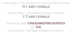
So what would be an effective chart type that could achieve the goal of emphasizing where companies were either overrepresented or underrepresented, for a specific gender or ethnicity? Given the two color approach, I felt an effective way to do this would be to use a diverging bar chart and focus on the difference within each company from the US Population. So for each field (Female, Male, etc.) I needed to calculate the difference in the number employed for a company by the number represented in the US Population. For example, women make up 51% of the US Population and 17% of employees at Nvidia. But to simplify a bit, I took the percentages out of the equation and instead went with absolute values per 100 people. So, we could say;

  • For every 100 people in the US, 51 are female
  • For every 100 employees at Nvidia, 17 are female
  • 17 minus 51 is negative 34, so;
    • At Nvidia, for every 100 employees, there is an underrepresentation of 34 females. And conversely, males would be overrepresented by 34 for every 100 employees.

For reference, I included these figures in my tooltips (see below). tooltip

There’s likely a more efficient way of going about the calculations, but since each gender and ethnicity was its own field, I created six calculations, one for each field that would be included in my visualization. And once it came time to move onto the tooltip, several more calculations came into play in order to get the color coding to work. This approach worked here, but if there’s a quicker, easier way of tackling this part of the project and you happen to be reading this, I’m all ears!! So anyway, after going the diverging bar route, here’s what the view started to look like.

wk46.1

With the addition of a ‘sort by’ parameter and the highlight action mentioned earlier, I was starting to like how the visualization was coming together. It encouraged exploration, while providing a quick snapshot of the entire picture. It was easy to see, for instance, that Latinos were underrepresented at all companies (in the above image), while Asians were overrepresented at all companies. The user could sort the data various ways and also had the option of seeing more detail about a particular company if that was of interest; either through the highlight action or through the tooltips.

My final visualization is below and the interactive version can be found here. My hope is that this post and future posts are helpful to those who are early on in their analytical and #dataviz journeys and are looking to either build their skills from the ground up or improve upon their existing skills. If you have any questions at all, whether its something you liked or something you did not like, please don’t hesitate to reach out to me through Twitter at @JtothaVizzo. Thanks for reading and have a great day!

wk46final


#MakeoverMonday Week 44 Diary

IMG_3289

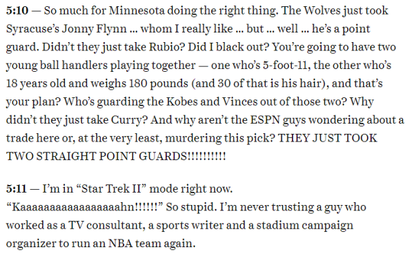
My first #MakeoverMonday Live came last week at Tableau Conference in New Orleans. It was an awesome experience that I’m happy to have been a part of!! As far as #MakeoverMonday’s go, in the past few months, I’ve been trying to do a better job of time-boxing myself to a one hour limit, which helped me in being more prepared for the Live version, than I would have been several months ago. So, moving forward my goal is to combine staying around that time limit while implementing the following format…For those of you who have ever read or listened to sports writer, Bill Simmons, he is a favorite of mine. I was a big fan of the NBA Draft Diary columns he used to write. In his articles, Simmons would watch the NBA Draft and simply record his thoughts, as the draft unfolded. Here’s an example…and of course, being a Minnesota Timberwolves fan, it just happened that I clicked on the 2009 draft, one that haunts Wolves fans everywhere to this day. YOU’RE WELCOME GOLDEN STATE!!!!!!!! Anyway, in 2009 Simmons writes;

MN1MN2MN3

Ok, so you get the point. I’ll set the timer, work through the week’s project and record some key moments as we go. With this week’s data set bound to be a fun one, why not get right to work?!!

9:11pm – Since seeing Eva’s tweet about the poopy data set, my mind instantly began thinking of ways I could work in an Austin Power’s reference, “Who Does Number 2 Work For?” Unfortunately, I didn’t come up with anything great, but hopefully somebody else does. While looking over the data a bit, it became clear to me that the aim should be to call out those people whose hand you should think twice about shaking. For the record, it blows my mind that people choose to NOT wash their hands after using the restroom, it’s just absolutely disgusting!!

9:18pm – With the decision made to call out those who fail wash their hands 100% of the time, I grouped all other responses together. This way I could incorporate some easy to understand bar charts while having just two bars for each gender, as opposed to six. One bar would represent the percentage of females/males in which you should feel confident shaking their hand, while the other would represent those where you should think twice. Reason behind this decision is if you aren’t washing your hands 100% of the time after using the restroom, I do not want to shake your hand!!

9:24pm – With the decision made on how to display the data, I was still left with three locations. In an attempt to make my visual simple and clean, I decided to focus on only the “While at work” location, as I felt it made for an interesting, albeit disturbing story line…that their are likely co-workers among you who failed to wash their hands after last using the restroom. Here’s the final bar chart, displaying the percentage of co-workers who always wash their hands. Simple and to the point…80% of females wash their hands all the time after going number 2 at work, making it ok to shake their hands. For the men, 77% do the same. The only calculations I made this week were simple text calculations that I would use to label the left side of my bar charts.

shake3

9:33pm – Probably 60-70% of my time with this viz was spent searching for and editing the two icons below, that indicate the act of shaking hands and giving knucks/fist bump. Taking a quick look back through my Tableau Public profile, I noticed that I really don’t use icons often, so this was a fun change of pace, but also fairly time consuming. For those of you who may be newer to #MakeoverMonday and Tableau Public, two great resources for finding icons are flaticon.com and thenounproject.com. For more on fonts, colors, etc. be sure to check out The Tableau Assistant Directory from Rebecca Roland.

10:08pm – Closing in on one hour, I finally had my icons edited through the use of PowerPoint and placed on my dashboard with the final visual looking like this.

visual

10:34pm – After adding a title (I took Eva’s comment, below, to heart!!) and some text to explain the viz, I tacked on the typical info on the bottom, including the source and it was time to save to Tableau Public…after a handful of tweaks to get the formatting to display correctly on Tableau Public, I was finished. One hour and twenty-three minutes, from start to finish, not too bad for my first #MakeoverMonday Diary.

evatweet

Click here for the final product…Thank you for reading!!

#MakeoverMonday Week 15 (Arctic Sea Ice Extent)

During #MakeoverMonday Week 15, I learned a lesson I’d like to share. First off, I felt the original viz did a good job of telling the story that in the Arctic, the area of ocean with at least 15% sea ice (known as the Arctic Sea Ice Extent) has been declining and that in recent decades that decline has become more rapid. So, with the original viz being an effective one in my opinion, I decided to go for what I believed to be a first in my short #MakeoverMonday tenure…stick with the original viz and simply create a variation of it.

With a plan in place, I set out…the line graph itself took virtually no time to make. I created a dimension called ‘week,’ threw it on the columns shelf, put AVG(Extent (million sq km) on rows and I had a line. Then, I needed to separate out the years, so I added YEAR(Date) to detail and got many little lines that looked something like ‘First pass,’ below. This was a good start, but I wanted to be able to clearly tell which years where most recent, so I added ‘Date years’ to color and arrived at ‘Adding color,’ below.

wk15.1
First pass
wk15.2
Adding color

So, now it looked like we were getting somewhere, as recent years were now displayed in orange. However, as opposed to seeing all the lines for each year, I wanted to sort of blend the years together, so I cranked up the line size and boy did I like what I saw…

wk15.3
Thickest lines possible

At this point, I was thinking, yeah this makes sense. Blue represents cold and the orange color represents the warming, which is in turn causing the Arctic Sea Ice Extent to decrease. Perfect, we’re good to go. So, I published my viz and shared it on Twitter, getting some positive feedback along the way. Then, the highly anticipated #MakeoverMonday blog post came out, where Andy covered a couple lessons. His lesson on color hit me right away…

wk15.4

I realized that with the use of blue/orange, I had done exactly what Andy mentioned, which was use color to convey temperature. However, the data was about more ice or less ice as opposed to hotter or cooler temperatures. So, I made the mental note and as soon as I had a chance to make the change, later that morning, I swapped out the blue/orange for blue/white, resulting in the below. A much more impactful final product, thanks to a great lesson from Andy, one that has taught me to be more mindful of what the data is about before jumping into design and color choices.

wk15.5
Final result

Name That Baby!!

baby-name-surprised

In 2014, when my wife and I went to the hospital to have our first child, we were all packed up and as prepared to go as we could possibly be. Living just a few blocks from the hospital, the option was available for me to swing home, with ease, if needed. But, nonetheless, the bags that would accompany us sat, packed in our spare bedroom, for the better part of two weeks. However, as prepared as we were with packing, we were equally unprepared in another major part of this whole baby having process…what the hell would we name the baby??? As there are few surprises in life, we chose not to find out the sex, though everyone assured us we were having a boy. So, needing both a girl and boy name, over several months we periodically looked up lists of baby names and talked about which ones we liked or didn’t like, but never seemed to gain much ground. Finally, the day was here and as we rushed out the door, our list was still incomplete, consisting of a single maybe for a girl name and exactly zero boy names. Well, as it turns out, we wound up having a beautiful baby girl and our maybe name, Ruby, seemed to fit her perfectly. Whew, crisis averted!!

Now, as 2017 comes to an end and we usher in 2018, we are expecting our second child in just over three weeks. And here we are sitting in the same situation. Once again, not wanting to find out the sex, this time we’ve been able to muster up one boy name, but zero girl names!! So, how does any of this pertain to Tableau and/or Data Visualization? Funny you should ask…

Screen Shot 2017-12-29 at 11.19.00 AM

Why the Viz?

After going through the same song and dance we went through in 2014, I decided to leverage my passion for Tableau and Data Viz as a new way to approach searching for baby names. Having lost track of how many times I’ve Google searched phrases including “baby names,” it seemed only right to try and make the process more simple and fun. Eventually, I landed on the Social Security Administration website, where I was able to find data on the top baby names, by decade. After narrowing down my list to go back only to the 1920s, as opposed to the 1880s, I began gathering the data.

How Can it Help?

The process of picking out baby names may be easy for some, but very difficult for others. For us, it has been the latter for a few reasons that I won’t go into. Either way, in our situation, my wife and I both tend to stay away from the ultra popular names of today, as we prefer classic names that are beginning to come back in a small way, especially for girls. This is how we landed on Ruby, which also happened to have some meaning to us. So, with these thoughts in mind, I wanted to trend the popularity of baby names over time and use that to determine if the criteria are met for a specific name.

How Does it Work?

Dating back to the 1920s, a lot of names have landed in the Top 200 most popular baby names for a given decade. So, with so many names to weed through, I needed a way to filter down the options of what was viewable at a particular time. Thus, the viz is basically useless without the first of three dashboard actions;

  1. Name Begins with Filter: Including an A to Z list on the lefthand side of the viz allows the user to filter to names that begin with a desired letter. Once a letter has been selected, the second and third dashboard actions come into play.
  2. Name Rank Trend Highlights: Hovering on a girl name will highlight the name rank trend below, while hovering on a boy name will do the same for the boy name rank trends.

Once your name is highlighted in the line chart, you will see its initial Top 200 Rank, as well as all subsequent ranks, allowing you to easily see if the name has increased or decreased in popularity. Here’s a quick example; Although the spelling is different, the name Brittany entered the Top 200 in the 1980s, ranking #21 among girl names. By the 1990s it had climbed to #7. And then in the late 1990s, Britney Spears  became a thing and by the 2000s the popularity of the name Brittany had plummeted to #189. Coincidence? You be the judge.

My hopes are that this viz can be helpful in several different ways, regardless if you like popular names, classic names or anything in between. Thank you for reading, now GO NAME THAT BABY!!


Viz What You Love: Part II

cmavizJust over three weeks ago, I posted a viz about Notre Dame football, supporting it with a blog post called ‘Viz What You Love,’ professing and detailing my love for the Fighting Irish football program. A few days after that post, I shared a viz outlining the history of the CMA (Country Music Association) Awards Album of the Year winners. Having grown up in the middle of nowhere, literally, in northwestern Minnesota, sports and music were two of the things that became very important to me early on in life. While, my desire to be active and competitive fire were fueled through sports, music was always there when it was time to relax, study or have fun. I love several genres of music, but where I grew up, country music was big and it has always had a place in my heart. My first ever CD was John Michael Montgomery…no seriously!! And my first ever concert was Tim McGraw, way back when his only hit was “Don’t Take the Girl.” The point is that I love country music and that one really fun way to continue improving your Tableau skills is to produce data visualizations about things you love. I like to call this “Viz What You Love.” Part II is about my CMA Awards 51 Albums of the Year viz.

When I first saw Sean Miller‘s ‘The 100 Greatest Metal Albums of All-Time’ viz, I was blown away not only by how cool it was, but also by how much information was right there at my fingertips. Now, while I’m not a huge metal-head, I’ve listened to enough to know many of the artists and albums on the list, among them Black Sabbath and Ozzy Osborne. The very first thing that caught my attention on Sean’s viz was the range of energy in Black Sabbath/Ozzy albums vs. those of Slayer, which is all energy, all the time. I hadn’t heard much Slayer before, so pulled them up on Spotify. You could say their music is…aggressive!! Anyway, I thought Sean’s viz was awesome and I wanted to try something similar from some music more familiar to me. The first step would be to find a data set…well wouldn’t you know Sean also blogged about his viz and included a sweet little trick you can do in Spotify to capture several different attributes. Thanks for sharing Sean!! Here’s the link he included in his blog that helps you sort your music, so you can then throw it into a spreadsheet and start visualizing. This process is much more seamless than I was expecting, so that was a pleasant surprise!!

As for song attributes, I chose beats per minute, energy, acoustic and popularity. Being country music was my choice, I thought valence may also be interesting, but it didn’t tell the story I was hoping for. I included all songs from each album, because I wanted to see any clustering, especially on the low and high ends of each attribute category. For instance, a majority of two-time Album of the Year award winner, Charlie Rich’s music is low energy and highly acoustic, while recent two-time winner, Chris Stapleton offers a wide variety on his albums. The extreme unpopularity of country music from the 60s through the 80s is clear, save a few notable exceptions such as Merle Haggard, Kenny Rogers and Willie Nelson. There’s a gradual increase in popularity, the newer the music is and neither of these facts are a huge surprise when you think about the demographics of Spotify listeners. I’m really going out on a limb here, but my hunch is that more millennials are using Spotify than senior citizens. I mean, my dad certainly isn’t on Spotify…can you get Spotify on a track phone??? Wait, is it track phone or TracFone? Ah, who the hell knows, the point is not many millennials are listening to Ronnie Milsap, Alabama or George Strait, but they damn well should be!! Ok, here’s what I like about the viz;

  • Like I mentioned earlier, I’m a fan of including all songs on the dot plot, as the clustering of songs within an album is interesting to see.
  • I would have never chosen these colors on my own, but a quick Google search led me to colors associated with each genre of music. So, I chose four related to country music and feel that they actually look pretty nice together, thanks in large part to the dark blue background.
  • I think the highlight actions work well, as you can hover on a song under one column and easily see where that song falls in the other categories as well.

I hope you enjoyed reading, now go out and Viz What You Love!! Thank you again for the inspiration Sean, this was a really fun project!!